
A basic guide to using icons in a design system
Part I: Icons overview


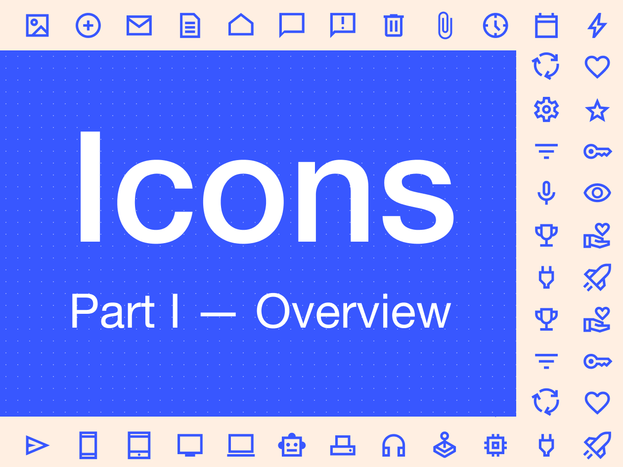
The role of icons is important in design systems. They're small visual elements that act as building blocks (atoms) and are used to build more complex elements (molecules, organisms, templates, and pages).
★ Design tip
Brad Frost in his book Atomic Design was one of the firsts to define icons as basic elements of a design system. Within his famous classification, icons are part of the atoms of a design system. If you would like to know more, check out Atomic Design by Brad Frost.
They follow a set of rules and design guidelines established and help users understand and navigate effectively, while ensuring that all visual elements are aligned with the brand and product guidelines.
Icons are used to ensure coherence and consistency in the appearance and functionality of an application or digital product. They often represent actions, functions, or categories to facilitate communication of information and user interaction.
✱ To keep in mind
Icons are designed to align visual elements with the brand and help the user understand and use a product or service.
Get started
First steps
We recommend starting with a ready-made icon library to start a design system from scratch because it takes a lot of skill and time to make your own custom icons’ library.
How to choose an icon library
In the early stages of creating a design system, where multiple important decisions need to be made, the choice of icon library is typically reactive and based on subjective opinions. This is something we should avoid because it could cause medium and long-term problems related to brand expression, lack of consistency in our product and the teams' productivity.
Choosing the right library of icons for our design is like deciding what to wear to a party without knowing the dress code. At first, we can decide what we like to use based on our intuition. But as we move forward with the design system creation, we'll see that these icons have more power than we thought. The choice of icons will affect how people use and understand the product, how the brand looks, and how productive the different teams are.
For this reason, although the choice of icons may seem insignificant, we must ensure that they align with the tone and voice we are looking for our brand. And that they meet the needs of our product and its users. After all, no one would like to attend a gala in a clown costume.
Icon properties
It is important to be clear about the different properties that our icons can have to choose a set of icons that fit our product. These are the most essential properties to consider when selecting an icon library.
Icon styles
Outlined
Filled
Duotone
Flat
Icon style modifiers
Stroke ending
Corner radius
Stroke weight
Icon sizes
Icon styles
Style is the hardest property to define and can be confusing when trying to figure out what an icon is. For this classification, we wanted to exclude the small illustrations that some design systems include as part of their icon library. This way, our style classification only considers the border or fill properties, and it would look like this:
Outlined: Icons that are made up of strokes. Outlined icons can't have filled shapes.
Filled: Icons that may have both, strokes and filled shapes, but will always use the same color.
Duotone: Icons that are made up of paths and filled shapes and, as the name indicates, use two colors. One for the paths and one for the filled shapes.
Flat: Icons that only use filled shapes with 2 or more colors.


Icon style modifiers
Style modifiers are properties that we can use to adjust the look and feel of our icons.

Stroke weight
The weight modifier is a parameter that defines the stroke thickness of the icons and is closely associated with the weight of the typography. That's why they're usually classified using the same scale as fonts. From 100 (Thin) to 900 (Black) or using a value that refers to the thickness of the stroke (1px, 1.5px, 2px…).


Stroke endings
The stroke ending modifiers can have 3 different options: without endings, with rounded endings and with square endings.

One advantage of the option without endings is that it prevents the endings of our icons from being prolonged.

Corner radius
The corner radius modifier has two options. The most common one is to set the radius of curvature using a fixed measure in pixels.

There's also another option that's similar to the stroke endings, which lets you choose between two values: with sharp corners (Sharp) or with rounded corners (Round).

Icon Sizes
Most icon sets use a base size of 24×24 pixels. In future articles, we'll talk more about this topic, but for now, let's just say that the base size for our icons should be 24x24.

We will use different sizes for different types of interfaces, depending on where they will be used. Here are some things to keep in mind.
Icons < 24px
Icons smaller than 24px are typically used in desktop applications. For example, in dense interfaces, the 20x20 size is usually used by default, and for specific cases, such as mobile devices, where the icon is associated with small text, we can use sizes of 16x16 or even 12x12. It is not a good idea to overuse this last size, as icons of this size are often difficult to identify.
Icons > 24px
Icons larger than 24 pixels are frequently associated with large or highlighted texts. We can find them in sizes of 32, 40, 48, or even 56 or 64 pixels. It is important to remember that the different sizes will be given by the components of the design system and the typographic scale that we have. These icons are optimal for presentations or large screen sizes.

✱ To keep in mind
You've probably noticed that all the sizes we've mentioned are multiples of 8. This is because most design systems use an 8-pixel grid as part of their foundations. If you want to know more about it, take a look at: Everything you should know about 8 point grid system in UX design.
Creating our icons library
Now is the time to choose a set of icons that match our brand and start building a design system that uses all the learned concepts.
In our case and to start working, we have decided to use outline and sharp icons; without endings and without corner radius. We’ll also use a stroke weight of 2px for the base size of 24px.

Adding icons to Figma
There are countless collections, both paid and free, to start looking for the set that fits your brand and product. If you don't know where to start, we suggest two options:
1. Search in Figma Community
Filtering by files and templates with the icons label will show you a lot of free and paid libraries. The best thing you can do here is look for the set that best fits your needs. Many well-known libraries also have plugins that can be imported directly into Figma. Which will be a great help to you.
2. Search on Iconify
We like using Iconify to do the first tests. A tool created by Vjacheslav Trushkin that allows you to search for and import icons into Figma through its plugin or website. It has a multitude of open-source libraries available that have been updated since 2016.
Guidelines
Go to the Iconify website
You can search by performing a search indicating the name of the icon you are looking for. For example, “home”. Then you can filter by:
Adding the “home outline” style.
Adding “home sharp” modifier.
Filtering by collection and using its internal classification.
Select the one you like the most to go to its detail page.
Configure options.
Copy and paste the *.svg code into Figma.
Icon organization
Now that we know which icons we want to use, it's time to decide how to organize and name them.
It's possible that an icon that was meant for one thing ends up being used for something else, even though it wasn't planned. It's normal to have numerous questions when it happens.
For example, if we had to name one of the most common symbols used for “settings”, we might wonder: How should we name it? Descriptively, calling it “gear”? Or semantically calling it “settings”?
As usual, it depends. Our recommendation is that you start in the simplest way, adopting the rules of your chosen collection, or following these basic rules that we can adapt and expand according to specific cases.
Descriptively
Objects (mail, image, clock, calendar, robot…)
Arrows (arrow, chevron…)
Semantically (by usage)
Actions (download, search, back, reload…)
Symbols (warning, info, error, help…)
The organization of our icons is always important so that they are easy to find and use. To accomplish this objective, it is imperative that the design system incorporates naming conventions that are both intuitive and with a set of rules capable of adapting, scaling, and, most importantly, facilitating the search for icons.
Naming conventions
For spacing in the names of our icons we recommend using the underscore _, since it is the one that will give us the least problems as it is compatible for Web, Android, and iOS. i.e: check_box
Since we are not going to add additional styles or sizes to our icons, we can use a fairly simple naming convention like this.
naming convention:
ic_{iconName}_{style}_{modifier}_{size}

sample:
ic_check_box_outline_sharp_md

simplifiyng
ic_name
Our first Figma icon components
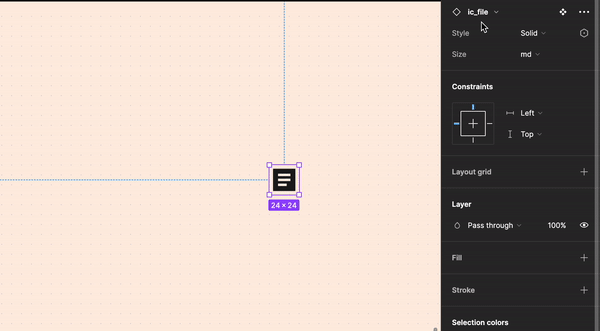
Once we are clear about how we are going to organize ourselves and the different styles, types and sizes that our icon library will have, we can start creating our first icon components in Figma.
In order to search for each of our icons through the Figma instance search engine, we must create a different component per icon in our library and not create them as component variants.
Generating them as variants is a fairly common mistake because it seems the most logical and intuitive. However, once we incorporate diverse styles and sizes, it will become more challenging for us to locate the various icons, and, ultimately, the maintenance and expansion of our icon library will become more time-consuming. This is why we must emphasize that we must create one component for each icon.
In the following example we have put three different icon components: ic_email, ic_delete and ic_file. To each of these components we add two different properties (Style and Size) with two values for the Style property: Filled and Outlined and a single value for the Size property: md (24px).

We can now add descriptions to our parts with Figma's recent updates. This is helpful for putting different keywords on the same icon to make it easier to find. For example, we can add keywords such as mail or chat message to the email icon. This way it will be much easier to locate.

Following the previous steps, we can use our icons and their different styles as follows:
Handoff
It is important to note that when there are different sizes of icons, it is essential to consider how they will be delivered to development. We will talk more about this in another article, but for now, we will tell you that the handoff to development is as essential as the creation of the icons themselves. Therefore, it is indispensable that we talk to the development team to figure out how we are going to use our icon library, how we'll organize ourselves, and find the best way to organize ourselves.
Thank you for reading and for reaching the end of the article.
This is one of the first articles well share in the coming months. To know more about us, we'd love to hear from you.
Pablo Bellver — Product Designer on a mission and Design System Lead by destiny at Job&Talent. Battling pixel imperfections with my mighty stylus! 🎨🖌️✨
Rafa Garcés — Senior Product Designer, currently working on creating a new design system with the awesome folks at PayFit
Para cuando la parte 2? :)